Advanced Art Theme Project
Here are the final art pieces of my project for the semester.


Theme "Blog"
Main Idea.
The main idea for this theme is that I want it to show something like hope in a place or setting where it seems all is lost and/or desolate. This will give me the chance to really work with grey scale values
Final Statement.
For Advanced Art, my five pieces surrounded the theme of there being at least a glimmer of good, or hope, in a situation that it seems is barren and devoid of positivity. It’s my way of illustrating an optimistic view of life, something that is very important to me, and how I think everyone should make an effort to think. It’s to always look for an upside or at the very least a sign that, however horrible the current situation, that it will improve eventually.
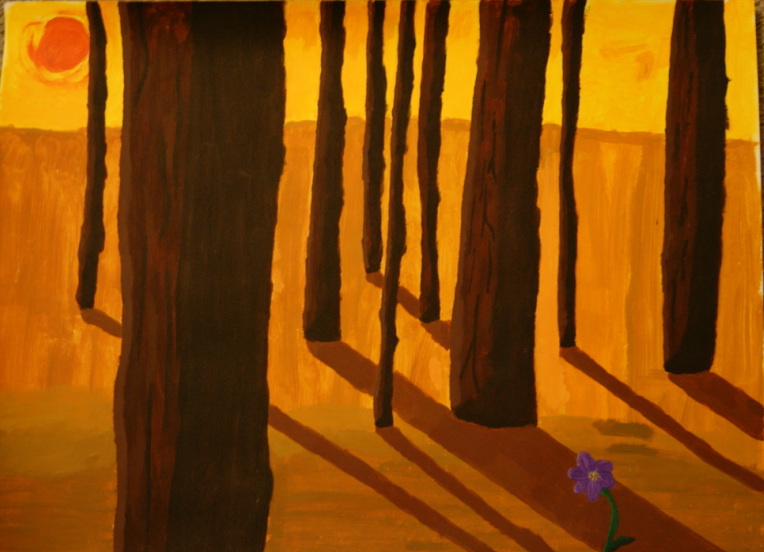
My first piece, and the largest, was an acrylic painting. It depicts a very hot and barren-looking wasteland, with very long shadows and a rough-edged sun. The colors are very warm (yellows, red, oranges) to give the impression that the scene is hot and uncomfortable to be in. But then in the very bottom corner, there is a bright purple flower, filled with tiny detail, proving that even in a land like that, there can be beauty.
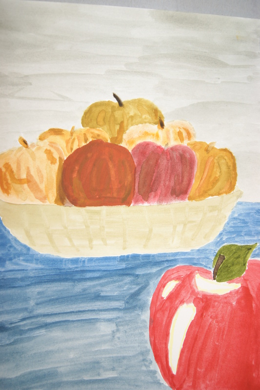
The second piece was a watercolor, with close to the same idea. The main focus of the picture is a bowl of apples that are old, rotten and just generally discolored. But then in the foreground is a red, very healthy looking one which gives the impression that amongst death and rotting, life can still prevail.
My next project was a printing on a rubber sheet. It closely follows the two before it, because the sky, ground, and roots of the flower are dull grays and browns. But then the petal part of the flower itself is full of color and flair. It’s a bit of a mix between the two previous ones, in the sense that it gives. This was actually my first attempt at printing, and as such I’m reasonably proud with the way it turned out. I did, however make it a mixed-media piece, by adding in details to the flower petals with acrylic paint. Not enough to take away from the fact that it was a print, but just enough to still easily fit into the theme.
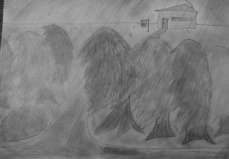
The fourth piece was done in pencil (graphite) and is one of the two smallest pieces. It depicts a dark, rainy landscape with trees bent in the wind and sideways rain. In the back corner though, is a small building that obviously has a warm fire going, and seems to almost glow with comfort. It is literally shelter from the storm, and can be inferred metaphorically as such as well.
My fifth and final piece was created using black charcoal. The bottom of the piece, which is what first grabs the attention, is a very dark alley way with a dumpster, and dirty ground. It’s just not generally a very inviting place. Then the father up on the piece, it begins to become lighter, as the scene starts to open up into the street, a far less dangerous place by comparison. It shows a way out of the intimidating place and, literally, into the light. Again, that can speak for itself metaphorically.
The main idea for this theme is that I want it to show something like hope in a place or setting where it seems all is lost and/or desolate. This will give me the chance to really work with grey scale values
Final Statement.
For Advanced Art, my five pieces surrounded the theme of there being at least a glimmer of good, or hope, in a situation that it seems is barren and devoid of positivity. It’s my way of illustrating an optimistic view of life, something that is very important to me, and how I think everyone should make an effort to think. It’s to always look for an upside or at the very least a sign that, however horrible the current situation, that it will improve eventually.
My first piece, and the largest, was an acrylic painting. It depicts a very hot and barren-looking wasteland, with very long shadows and a rough-edged sun. The colors are very warm (yellows, red, oranges) to give the impression that the scene is hot and uncomfortable to be in. But then in the very bottom corner, there is a bright purple flower, filled with tiny detail, proving that even in a land like that, there can be beauty.
The second piece was a watercolor, with close to the same idea. The main focus of the picture is a bowl of apples that are old, rotten and just generally discolored. But then in the foreground is a red, very healthy looking one which gives the impression that amongst death and rotting, life can still prevail.
My next project was a printing on a rubber sheet. It closely follows the two before it, because the sky, ground, and roots of the flower are dull grays and browns. But then the petal part of the flower itself is full of color and flair. It’s a bit of a mix between the two previous ones, in the sense that it gives. This was actually my first attempt at printing, and as such I’m reasonably proud with the way it turned out. I did, however make it a mixed-media piece, by adding in details to the flower petals with acrylic paint. Not enough to take away from the fact that it was a print, but just enough to still easily fit into the theme.
The fourth piece was done in pencil (graphite) and is one of the two smallest pieces. It depicts a dark, rainy landscape with trees bent in the wind and sideways rain. In the back corner though, is a small building that obviously has a warm fire going, and seems to almost glow with comfort. It is literally shelter from the storm, and can be inferred metaphorically as such as well.
My fifth and final piece was created using black charcoal. The bottom of the piece, which is what first grabs the attention, is a very dark alley way with a dumpster, and dirty ground. It’s just not generally a very inviting place. Then the father up on the piece, it begins to become lighter, as the scene starts to open up into the street, a far less dangerous place by comparison. It shows a way out of the intimidating place and, literally, into the light. Again, that can speak for itself metaphorically.
